A fan spotted an error in Olympic logo, prompting widespread speculation and jokes that suggested it might have been designed by an intern.
A notable error in the Olympic logo
Recently, a fan discovered a major mistake in the Olympics logo, sparking speculation that an intern might have designed it.
The error quickly caught the attention of many people online, leading to a lot of discussions and jokes about the situation.

The Olympic logo is a crucial part of the Games’ identity.
It represents the unity and spirit of the event, seen by millions of people around the world. Therefore, any error in the logo is bound to attract attention and scrutiny.
The mistake was so obvious that it made many wonder how it could have gone unnoticed during the design and approval stages.

Fan suspects that an intern may have made the Olympic logo
Marketing professional Kiandra Trickett, known online as ‘The Original Kiki,’ took to TikTok to clarify an error she noticed in the Olympics logo.
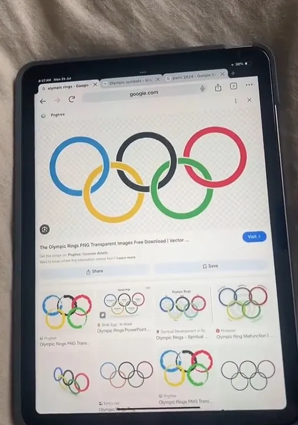
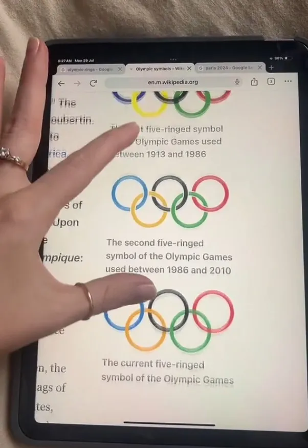
Comparing the current emblem to its predecessor used from 1986 to 2010, Trickett pointed out a significant difference.

“Did I just miss an Olympic ring rebrand?” she asks her followers.
While the new design features thinner rings, they still interlock, a fundamental aspect of the logo’s design.
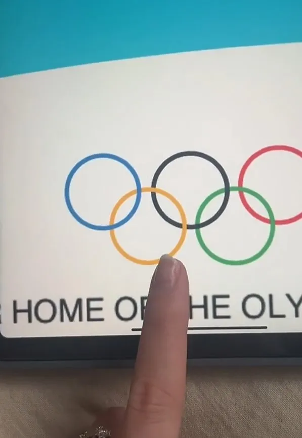
However, after inspecting the logo on the 9Now app, Trickett found an obvious differ.
The designers made the rings much thinner and oddly ‘layered’ instead of interlocked as expected.

“I think your designer has just created five circles that aren’t the logo,” she indicated.
“I’ve been looking at that for the past two days, asking, ‘What is wrong with this?’
“And now I’ve actually seen it up close… yeah,” Trickett said.
Social media reaction
Trickett’s TikTok video quickly garnered over 180k views, with viewers equally puzzled by the apparent oversight.
Some remarked humorously that it looked like the work of an intern or a project from grade school.

Comments humorously suggested that the Olympics might be feeling the pinch of the cost of living crisis; therefore, they had to cut corners on logo design.
The worst part is there not even interlocking, they are just layed one on top of the other, one user said.
the intern did it, the second user said.
I don’t even want to think how much they paid the designer! The third user commented.
Only a graphic designer would know that that logo wasn’t outlined, another wrote.
when the designer ask for a PNG of the logo but you get a DOCX instead so you make your own logo, someone said