After the creator of Nutella died at 97, people are just realizing the reason behind the black ‘N’ in the brand’s logo.
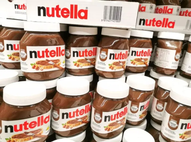
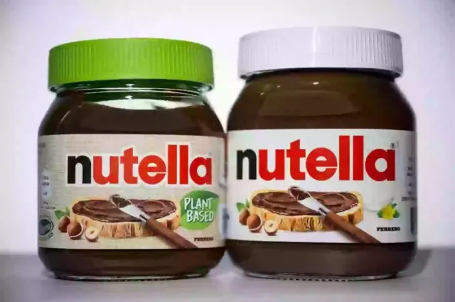
Nutella, the beloved chocolate and hazelnut spread, has a logo that many people recognize.
However, recent discussions have brought attention to the black ‘N’ in the logo.
This curiosity has grown even more since the passing of Francesco Rivella, the creator of Nutella, who died at the age of 97 on Valentine’s Day.
The Legacy of Francesco Rivella
Francesco Rivella, often called the “Father of Nutella,” played a significant role in the brand’s history.
He worked closely with Michele Ferrero, the founder of Ferrero. Together, they traveled the world to find the best ingredients for their chocolate products.
Rivella’s creativity and insight helped Nutella become a global sensation.

Nutella fans are finally realizing the secret behind the black ‘N’
After Rivella’s death, fans of Nutella began to ponder why the ‘N’ in the logo is black, while the other letters are red.
This question sparked a lively debate on social media. Many people were surprised to learn this detail for the first time, prompting them to share their thoughts and theories.
One user expressed their disappointment on X, stating, “I wanted to ask him why the N is black.”
This sentiment was echoed by others who felt they had missed out on an opportunity to understand the logo’s design.
Some fans suggested that the black ‘N’ could highlight the word “nut,” emphasizing the hazelnut content of Nutella.
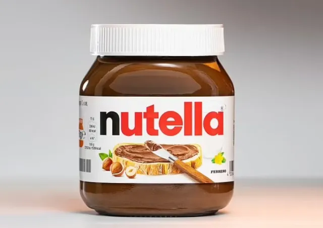
Others speculated that it was simply a design choice to make the logo more memorable.
Interestingly, the choice to use a black ‘N’ has practical roots.
When Nutella first launched, a company with a similar name already existed.
To avoid trademark issues, Ferrero decided to create a distinct logo. The black ‘N’ helped set Nutella apart from competitors while also creating a unique look for the brand.
This clever design choice has since become iconic, making the logo easily recognizable.
Social media reactions
The revelation about the black ‘N’ in the Nutella logo sparked a wave of reactions across social media platforms.
Many fans took to X to express their surprise and delight. Comments ranged from playful disbelief to genuine curiosity.
One user said: Identifies as a little bit on the dark side.
The second user added: If this is an N word joke I’m all for it
The third user commented: I always figured it was because it was pronounced (nu-tella) instead of (nut-ella)
The fourth user said: LMAO..Nut- nutella in love with pronunciation ..then maybe the “meaning”..
Another user wrote: N stands for nutrition
Someone said: Ive been saying that for year. I knew it would come