The bars next to the weather forecast have an important function.
Ever look at the weather app on your phone and wonder what the yellow bars next to the forecast mean?
Well, you wouldn’t be the only one as one person took to social media to reveal the true meaning behind it and the truth is blowing people’s minds.
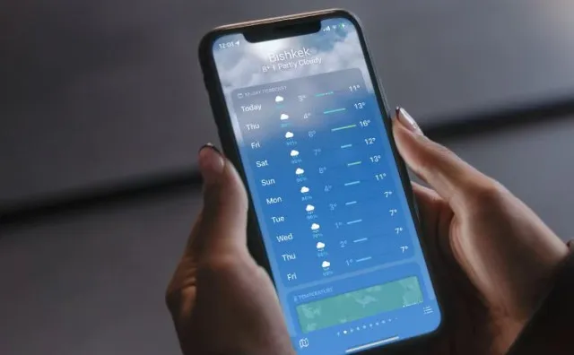
It turns out that they actually have a very useful function.
One Reddit user posted a screenshot of their weather app along with a query about what the bars could mean, adding: “I always thought it was just the temperature range but why is one bar slightly longer than the other when the temperature range is exactly the same for both days?”
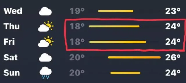
People were quick to come to the rescue, offering some insight into the meaning behind it.
One person provided their own screenshot and explained: “My understanding is that the bars represent the temperature range relative to the 10-day forecast, with the bar showing how close a day’s forecast is to the min and max temps over the 10 days.
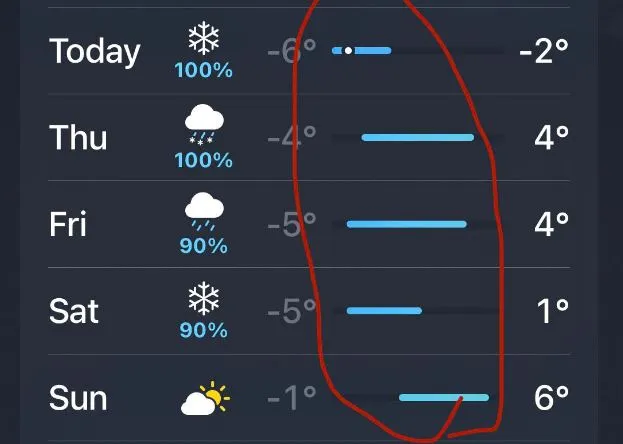
“In my screenshot, you can see that 4° C is the lowest temp in the 10 days, and so that day starts at the very left. 20° C is the highest temp, so that bar goes all the way to the right. A forecast like today’s only goes between 7 – 15° C, so the range of the bar is shorter.”
Another person described how the bars are ‘visual representation’ of the daily temperature range, adding: “It makes it easier to compare day to day temperature changes and trends.”
Interestingly, the color of the bars also changes depending on the temperature.
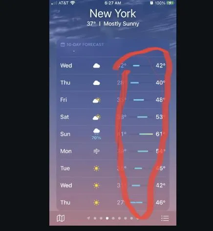
One user explained: “Dark blue is for temperatures below 0 Celsius, light blue 0-15 Celsius, green 15-20 Celsius, yellow 20-25, orange 25-30 and red 30 Celsius plus.”
This spurred many to react to this information, with one person describing the feature as ‘nifty’ while another person described the bar as calculating the ‘level of misery’ from the day.
However, it seems that not everyone is up to date with the latest weather tech for smartphones as one user questioned: “Wait when did you guys get bars?”
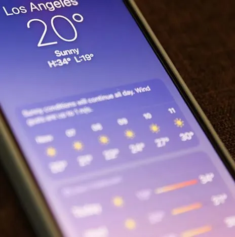
With the launch of iOS 18 from Apple, the tech giant has introduced two major changes to their built-in weather app.
The first enhancement is the ‘Feels Like’ temperature display, located in a prominent position on the screen to give users a more accurate feel of the day’s weather.
The second is a personalization feature which will display weather information for saved addresses.