Social media buzzed with confusion when a user uncovered a hidden message in the LG logo of the South Korean tech giant.
Do you own an LG product? It’s a great choice if you believe in the development of world technology.
Whenever you glance at the LG logo on your electronic devices, you might notice that it seems to be smiling back at you.
Well, I believe you find LG’s logo appealing. However, have you wondered about the meaning of LG’s logo? Many users on Reddit have also wondered the same thing
Social media erupted in confusion when a hidden message in the LG logo of the South Korean tech giant was uncovered by a user.
The revelation, shared on Reddit, quickly gained attention and sparked widespread debate about its meaning.
In a world saturated with new brands on our televisions, smartphones, and laptops, it’s easy to miss the subtle messages embedded in their logos.
Yet, some high street names incorporate clever designs that deserve closer examination. One such example is the logo of South Korean tech giant LG.
A user revealed the hidden message in the LG logo.

On Reddit, a user named @r/savedyouaclick shared the discovery, drawing attention to the hidden message in the LG logo.
The post read: :LG logo contains clever message that’s ‘hidden in plain sight’ for customers | The face in the logo is made up of the letters L and G”
In the comment selection, many viewers shared their knowledge about this message.
One person said: I also thought LG stood for Life’s Good.
A second wrote: in the early days when the company started in the UK, it was always known as ‘Lucky Gordon’.
While a third commented: I always thought that LG stood for ‘Lifes Good’. I wonder if this was a slogan on a TV advert.
LG logo hidden inviting message
At first glance, LG’s logo might seem like a simple design. However, upon closer inspection, it reveals a thoughtful and inviting message.
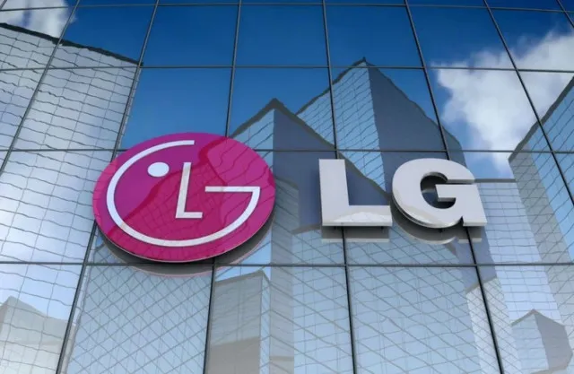
The logo features a circular shape with an ‘L’ as its nose, enclosed by a large ‘G’ that forms a smiling curve. The dot in the middle of the ‘L’ serves as an eye, collectively creating the effect of a cheerful face.
Expert explains LG’s Logo
A brand expert explains that these hidden elements are not merely decorative but are strategically designed to make LG appear more approachable and friendly.
According to LG, the circular arrangement of the letters ‘L’ and ‘G’ symbolizes several key concepts: the world, the future, youth, humanity, and technology.
A company spokesman elaborates on the logo’s significance, stating, “Our philosophy is based on humanity. It also represents LG’s commitment to maintaining strong relationships with customers globally.”
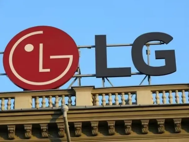
The primary color red is chosen to convey friendliness and a strong impression of LG’s dedication to delivering high-quality products. The company emphasizes that the shape and color of the logo are integral and must remain unchanged to preserve its intended impact.