Exploring the history of the Dairy Queen logo, its evolution, and uncovering the hidden meaning behind its unique design.
A good logo combines a striking design with a hidden meaning. Dairy Queen’s logo is a prime example of this, with its simple yet meaningful design.
The history of the Dairy Queen
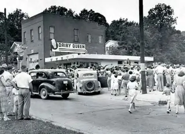
The first Dairy Queen opened in Joliet, Illinois in 1940. It started with a small soft-serve menu.

Over time, Dairy Queen expanded its offerings to shakes, banana splits, and Dilly Bars.
By 1957, they added hot food to their menu, blending cold treats with hearty meals.
In the early 1950s, the Dairy Queen logo was simple. It featured bold text on a blue background, spelling out “Dairy Queen.” A large soft-serve cone was sometimes added to signage.
The hidden meaning behind Dairy Queen’s logo
At first glance, the Dairy Queen logo seems simple with its vibrant colors. However, there’s more to the design.

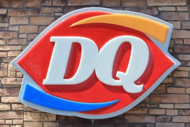
The red ellipse in the logo symbolizes lips, hinting at the act of eating.
The orange and blue stripes represent the restaurant’s combination of hot and cold food, or its “grill and chill” concept.
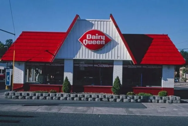
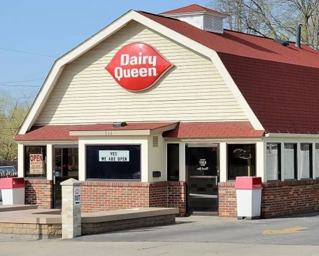
Dairy Queen’s logo has evolved over time. The 1960 version introduced the red shape resembling lips and white font spelling out “Dairy Queen.”
This logo lasted for over 40 years. In 2001, the logo was simplified to just “DQ,” reflecting how customers often shortened the restaurant’s name.

In 2007, the logo saw minor tweaks. The letters became italicized, and orange and blue arched lines were added for visual appeal.
What does the current Dairy Queen logo mean?
The current logo still incorporates the red shape symbolizing lips.
The orange line represents hot food, while the blue line symbolizes cold food, like DQ’s signature soft-serve treats.

This modernized version of the 1960s logo has become one of the most recognizable symbols of fast food and dessert across the nation.