Walmart unveils a new logo after 20 years, sparking mixed reactions from shoppers, with many sharing their opinions online.
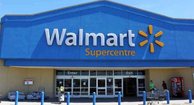
Walmart has introduced a new logo, marking the first change in 20 years.
This update has sparked a wide range of reactions from customers online.
Many are sharing their thoughts about the new design, with opinions varying from positive to critical.
Walmart reveals new logo after 20 years
On January 13, Walmart announced the new logo as part of a comprehensive brand refresh.
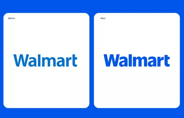
The update includes changes to the font, image, and color scheme.

The company describes the new “wordmark”—the term for the way “Walmart” is displayed—as inspired by Sam Walton’s classic trucker hat.
The logo now features a modern and custom font that aims to set Walmart apart from other retailers.
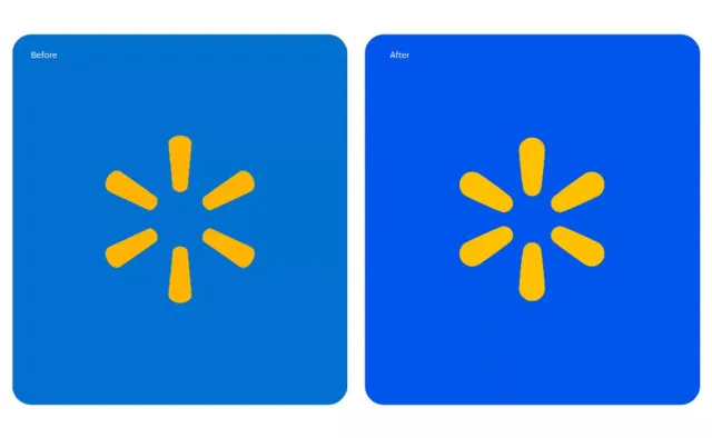
The logo also includes a yellow burst shape, which Walmart calls a “spark image.”
This element is meant to represent the energy of the company and guide customers through their shopping experience.
The brand has chosen colors called “True Blue” and “Spark Yellow,” which are familiar tones associated with Walmart.
Walmart emphasizes commitment to customers and brand legacy.
William White, Walmart’s senior vice president and chief marketing officer, discussed the reasoning behind the update.
He emphasized that the redesign reflects the company’s commitment to its customers while honoring the legacy of its founder, Sam Walton.
White stated, “This update demonstrates our evolving capabilities and longstanding commitment to serve our customers of today and tomorrow.”

He added that while the new logo looks more modern, it still embodies the principles that Sam Walton established.
The company aims to adapt as customer preferences change, ensuring that Walmart remains relevant in the retail market.
He added: “As our customers evolve, we will too. Our Walmart will always be their Walmart, and our brand will always be a testament to how we innovate and change alongside them.”
Social media reactions
Since the announcement, many people have taken to social media to voice their opinions.
Some users expressed approval of the design, appreciating that Walmart kept the iconic elements of the previous logo.
However, not all responses were positive.
Numerous users pointed out that the new logo looks almost identical to the old one.
That’s it, I’m going into graphic design. I’m pretty sure I could do it at this point, one user said.
I cut a half inch off my hair last time at the hairdresser and let me tell you, I felt like a new person, the second user joked.
It doesn’t feel like a change but more so they’ve made it modernized; darker blue & rounded edges really make it pop, the third user commented.
Just gotten a little thicker with age, like many of us! Another user said.
I’m thinking they paid way too much money for that “change,” someone said.

Walmart will slowly introduce the new logo.
Walmart has announced that it will gradually implement the new logo across various platforms and customer touchpoints throughout January.
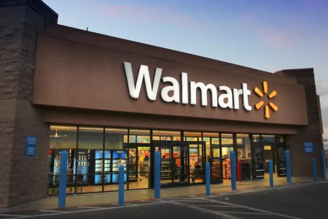
This means shoppers will begin to see the updated imagery in stores over time.
The company is committed to redesigning its stores as part of this brand refresh, aiming for a cohesive look.
The importance of branding
This logo change highlights the significance of branding in the retail industry.
A logo represents a company’s identity and can influence customer perceptions.

For Walmart, the logo serves as a symbol of its history and commitment to its customers.
As the retail landscape continues to evolve, Walmart’s decision to update its branding reflects its desire to stay relevant.
The company aims to attract both longtime and new customers with a modern twist on familiar elements.