Jaguar, a brand synonymous with luxury and performance, has revealed its striking new logo and branding.
However, the redesign has drawn sharp criticism and confusion from long-time fans and design experts.
A departure from the iconic leaping Jaguar
Unveiled on November 19, Jaguar’s new logo features a dramatic shift from its classic design.

The sleek, leaping jaguar and the iconic growler badge have been replaced with a minimalistic monogram of the letters “J” and “R.”
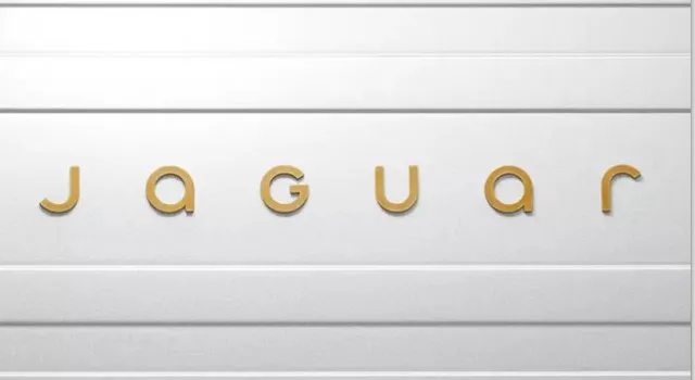
Additionally, the brand’s name is now stylized as “JaGUar,” blending upper and lowercase letters.
The company describes this redesign as a “seamlessly blended visual harmony,” marking the beginning of Jaguar’s transition into a bold and modern era.

Vibrant branding aims to redefine Jaguar
The rebrand extends beyond the logo. Jaguar released a vibrant promotional video showcasing models in colorful outfits and striking visuals.
The video is accompanied by phrases like “copy nothing,” “delete ordinary,” and “break moulds,” emphasizing the company’s commitment to creativity and uniqueness.

Color also plays a central role in the new branding. Jaguar’s identity now revolves around primary colors—yellow, red, and blue—paired with textures and movement to create a dynamic visual experience.
Chief Creative Officer Gerry McGovern stated that the rebrand is inspired by Jaguar’s founding philosophy of being “a copy of nothing.”
The new direction, dubbed “Exuberant Modernism,” aims to establish Jaguar as a fearless and artistic brand.
A mixed response from fans and experts

Despite the bold vision, the redesign has left many fans bewildered. Some questioned whether Jaguar’s social media accounts were hacked due to the drastic change.
Others criticized the logo’s design, labeling it as “ill-conceived” and a prime example of branding gone wrong.
One user commented, “What happened to prestige? Pace? Luxury? This feels disconnected from Jaguar’s heritage.” Another added, “This will be taught in design classes as a lesson on what not to do.”
However, Jaguar’s leadership stands firmly behind the rebrand.
They assert that the change reflects the brand’s fearless approach and its evolution into a fully electric future.
A strategic move towards the future
Leaders defend the rebrand as fearless and rooted in originality, with no plans for revisions.
Image Credits: GettyJaguar’s Managing Director, Rawdon Glover, explained that this redesign is part of the company’s transformation.
The decision to stop selling its previous car models a year before the launch was deliberate. This “fire break” aims to create a clear distinction between the old and new Jaguar.
Glover acknowledged that changing public perception is a challenging task but emphasized that the redesign is essential for Jaguar’s future as an electric vehicle leader.
Jaguar’s new branding sets a bold precedent, emphasizing creativity, modernism, and artistic expression. While the redesign has sparked controversy, the company’s leaders remain optimistic that this daring move will help redefine Jaguar for the next generation.
As the brand shifts gears into an electric future, the world will be watching to see whether this bold rebranding pays off.