7-Eleven, the popular convenience store chain, has recently revealed a hidden detail in its logo that went unnoticed for years.
This intriguing discovery has left people astounded and curious about what else they might have missed in the logos that surround them every day.
Logos play a significant role in the modern world, serving as visual representations of businesses and quickly conveying their identities to consumers.
While some logos are simple, others are more intricate, but over time, people tend to overlook the finer details and associate the logo with the brand without giving it much thought.
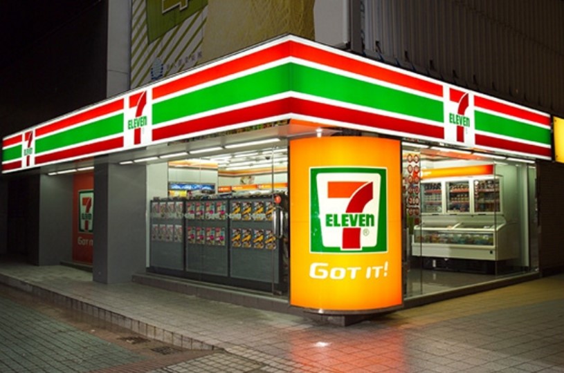
7-Eleven reveals hidden detail in logo that went unnoticed for years
However, someone on social media with the username @twosometravellers noticed a very small but important thing in the 7-Eleven logo.
In a video posted on Instagram in late April, the user captured the attention of thousands as they pointed out the unnoticed element.
The video quickly went viral, gained 150,000 views, and sparked astonishment among viewers.
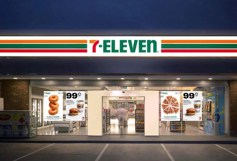
In the video, the person stood outside a 7-Eleven shop and looked at the sign with a confused face.
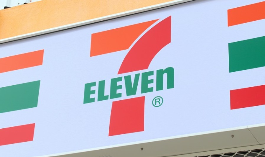
They then showed the store and the logo on camera. They pointed out that most of the letters in the 7-ELEVEN sign are big, except for the last letter 'n,' which is small.
In the caption, they wondered how they missed it and questioned if it was always like that. They had many unanswered questions about the logo.
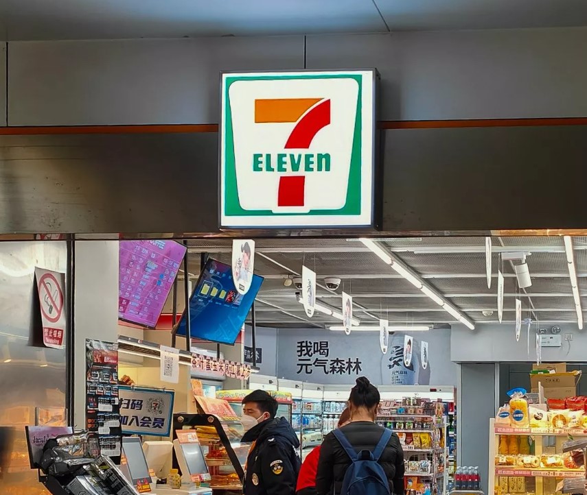
According to the account, the lowercase 'n' was a deliberate choice made by the original owner's wife, who believed it added a touch of gracefulness to the logo, in contrast to the harsh edges of an uppercase letter.
Interestingly, this detail has remained unchanged since 1968, surprising many who had never noticed it before.
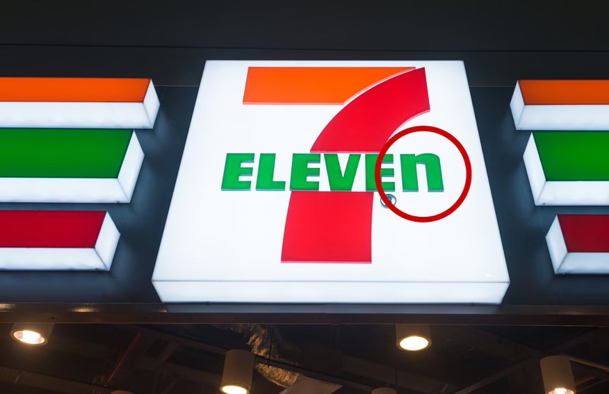
The revelation sparked various reactions on social media.
Some users expressed their amusement at their newfound awareness of the logo's detail. Others shared their own experiences, admitting they had also never noticed the lowercase 'n' until it was pointed out.
My wife and I worked for them at two different stores and shifts. The reason we didn’t notice is that we didn’t give a rat’s, one user joked.

There are 3 E. Did anyone notice, the second suggested.
The 7 looks like a highway interchange to me, someone wrote.
There's an arrow between the E and X in the Fed ex logo which represents delivering and going forward, another said.
Really?? I know this since the first day i sow it! Someone said.


