According to psychologist and leading color expert Karen Haller, the specific choice of red and yellow is intended not only to make the sign stand out but also to tempt you into the golden arches without you even realizing it.
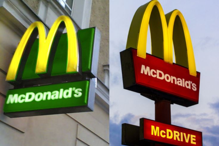
A psychologist has decoded the McDonald's logo and revealed the specific reason why the fast food chain may have settled on the colours red and yellow.
Karen Haller comes from the UK, who knows is an expert in applied colour psychology, and runs her own behavioral design firm.
In a blog post on her website, the expert said the combination of colours in the McDonald's logo is no accident.
Karen explained: "Red triggers stimulation, appetite, hunger; it attracts attention.
"Yellow triggers the feelings of happiness and friendliness. When you combine red and yellow it’s about speed and quickness. In, eat, and out again."
Delving into the science behind this, Karen wrote: "The language of colour is communicated quicker to the brain than words or shapes - as they work directly on our feelings and emotions."

So, the McDonald's logo is red and yellow, evoking feelings of happiness and friendliness. The combination of red and yellow symbolizes speed and quickness – in, eat, and out again.
Karen then proceeded to touch upon why McDonald's has changed a number of branch colours to green in recent times, which instead "elicits the feelings of nature, natural and environmentally friendly."
This interesting choice gives a more relaxed, and less rushed feel, in a way that Karen compares with fellow high street giant, Starbucks.
Many people were left amazed by Karen's explanation.
One person said: What we ordinary people call 'catching the eyes'.
A second suggested: Or, the other reason for yellow and red: the colors of mustard and catsup.
While a third said: Why not just bright colors so you can spot them? Like fire engines, post boxes, phone boxes, and buses - all bright red so you would see them, and not overlook them amongst the other surroundings.
Another said: Red and yellow. Ketchup and mustard.
Someone else added: Most food signs are Red or yellow because they encourage hunger.


